The Power of Data Visualization: Crafting Interactive Client Dashboards in Notion
Discover the transformative power of turning complex data into engaging visual stories using Notion, empowering you and your clients to make informed decisions.
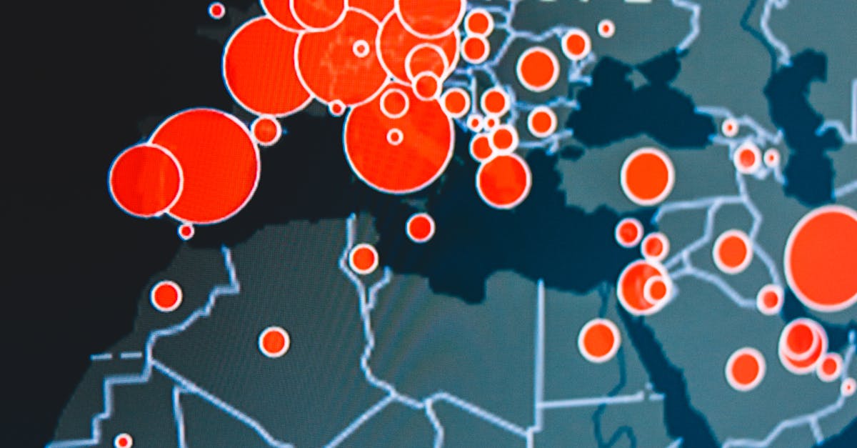
Table of Contents
Introduction
The advent of digital tools has greatly expanded the ways we can utilize data to drive decisions. However, it's not just about having data—it's about how we present it. This presents a significant opportunity: transforming raw data into visual narratives that foster understanding and inspire action.
The Importance of Data Visualization
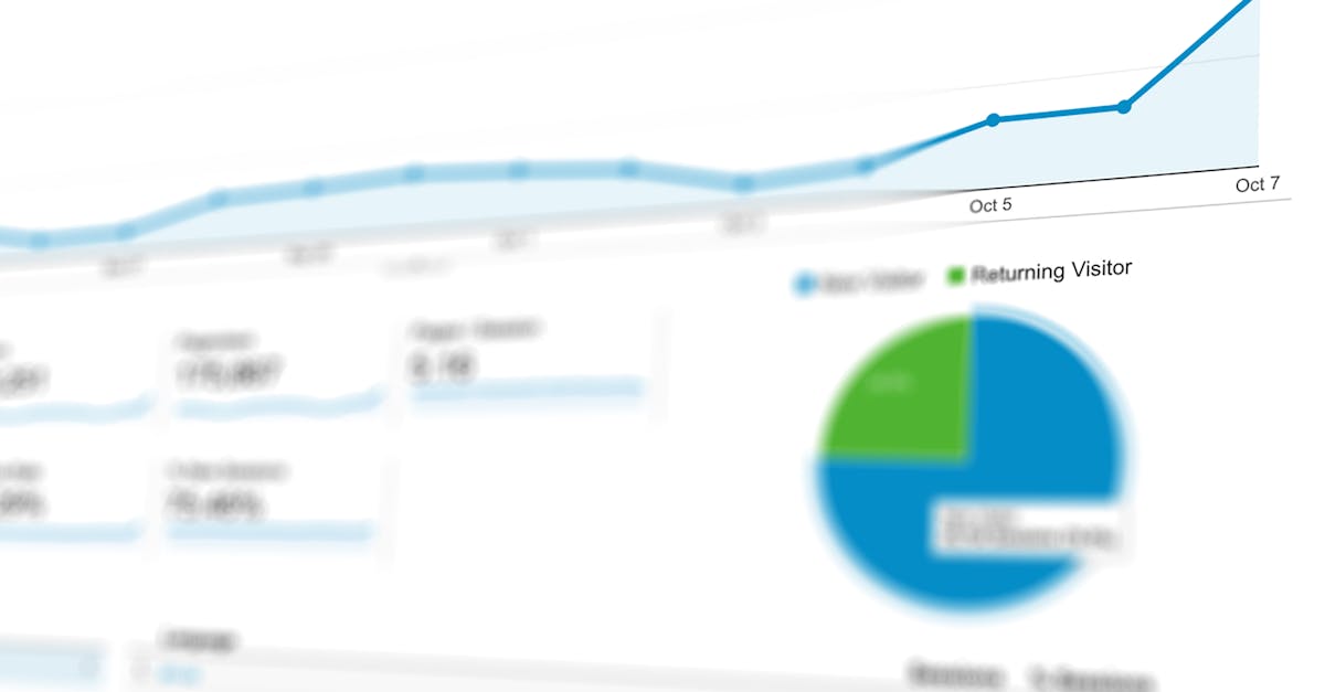
Data visualization involves presenting data in a graphical format. This makes complex information more accessible and understandable, facilitating better decision-making. In business, visually appealing and interactive dashboards are pivotal for client communication and strategic planning.
How it Enhances Client Relations
Clients are more likely to engage with data that is presented visually rather than in spreadsheets or textual reports. Interactive dashboards help clients explore data in real-time, offering a dynamic insight into performance metrics, opportunities, and risks.
Tools and Techniques
Choosing the right tools for data visualization is crucial. Notion offers several integrations and widgets that can transform your workspace into a client-friendly portal with custom dashboards that enhance productivity and engagement.
- Chart Widgets: Use tools like Coda Charts or embed Google Sheets to create dynamic charts that update as data changes.
- Data Integrations: Integrate with applications like Tableau or Power BI for advanced visualization capabilities.
- Custom Templates: Leverage Notion’s templates to create consistent dashboards for recurring use.
Integrating Dashboards in Notion
Implementing dashboards within Notion can streamline workflows and improve client interaction. This requires careful planning and consideration of the specific needs of your clients.

Steps to Integrate
Follow these steps to effectively integrate interactive dashboards into your Notion workspace:
- Understand Client Needs: Tailor dashboards to the specific analytics and insights your client requires.
- Select Visualization Tools: Choose tools that align with your clients' data and desired insights.
- Customize Dashboard Views: Ensure dashboards are easily navigable, visually appealing, and provide actionable insights.
Best Practices
Creating interactive dashboards that are effective requires a focus on clarity, user experience, and insightful data representation.
Here are some best practices:
- Simplicity: Avoid overcrowding dashboards with too much information. Focus on key metrics and insights.
- Interactivity: Enable filtering and dynamic data adjustments to better engage users.
- Customization: Utilize Notion's flexible features to match the dashboard with your brand or the client's preferences.
Conclusion
Data visualization is more than just creating graphs and charts—it's about telling a story with data. By using Notion to build interactive client dashboards, you not only enhance productivity but also empower your clients to make informed decisions. With these insights, you are poised to transform how you and your clients engage with data.
Ready to Create Secure Client Portals?
Join the waitlist to be among the first to experience FilterGate.